
Project developed in group, which I thank very much for the partnership, I learned a lot from them:
David Alencar, Wilbelison Junior, Natália Demuri, Eduardo Separovic e Halyne Nakazawa
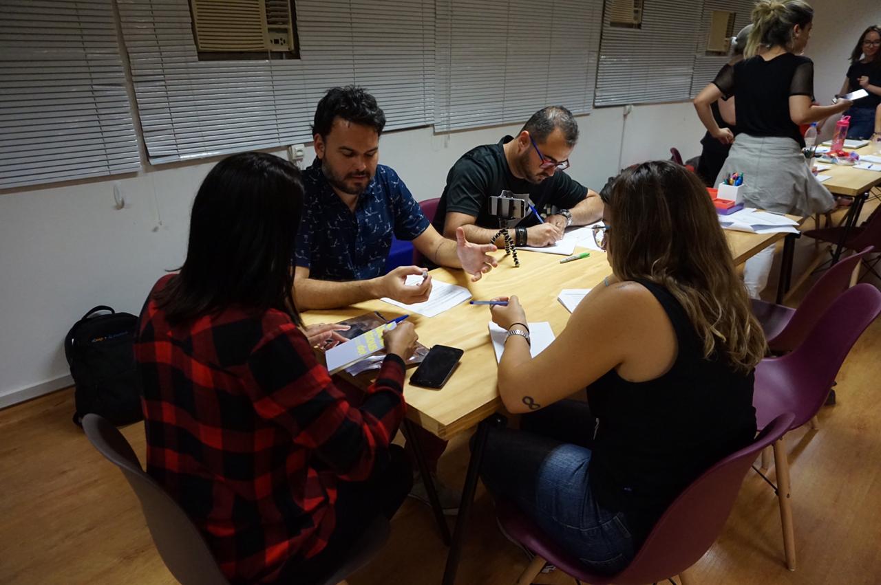
Everyone participated in all phases of the process. So, it was with me too, but I got even closer to the processes of discoveries and research with users and prototypes.
Challenge:
How to create a playful study experience for public service providers?
The “Concursando” project arose through the challenge proposed during the Training in UX Design, held at Mergo User Experience, in São Paulo.
Task flow
We developed the main task flow that meets ours (MVP), in the organization of time for study and placement test with test simulation.

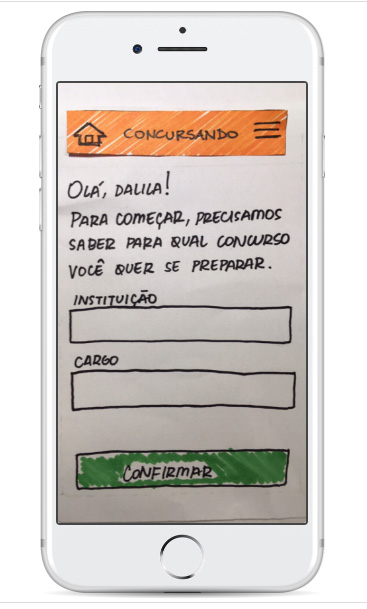
Prototype Low
We designed the App screens on “scribbled” paper, as it is very low cost and fully collaborative. We made the prototype navigable through the Marvel App, to later make usability tests. Browse the low-fidelity prototype!
Prototype High
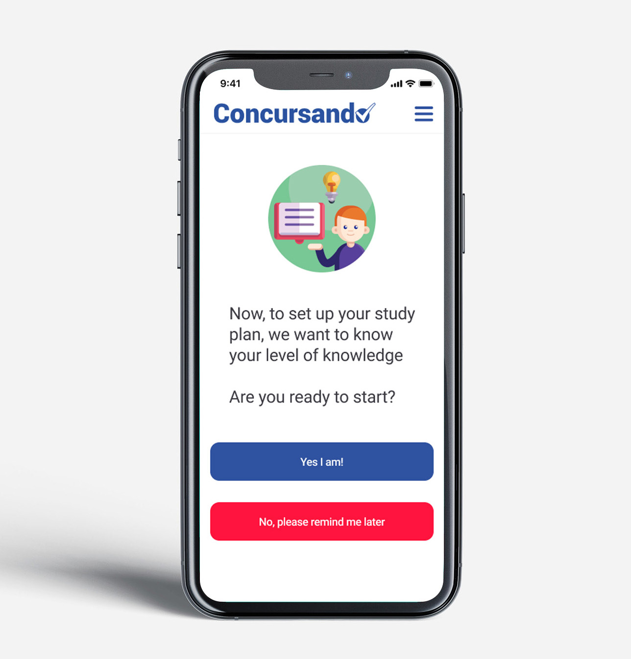
After refining with low fidelity, we develop in high fidelity.
Pros:
Information-rich feedback and simulation closer to the experience of the final product.
Cons:
The greater the flow, the longer the prototype creation time. We usually separate each step of the product journey. It is necessary to get caught up in some details, both visual and functionalities.
Usability Testing
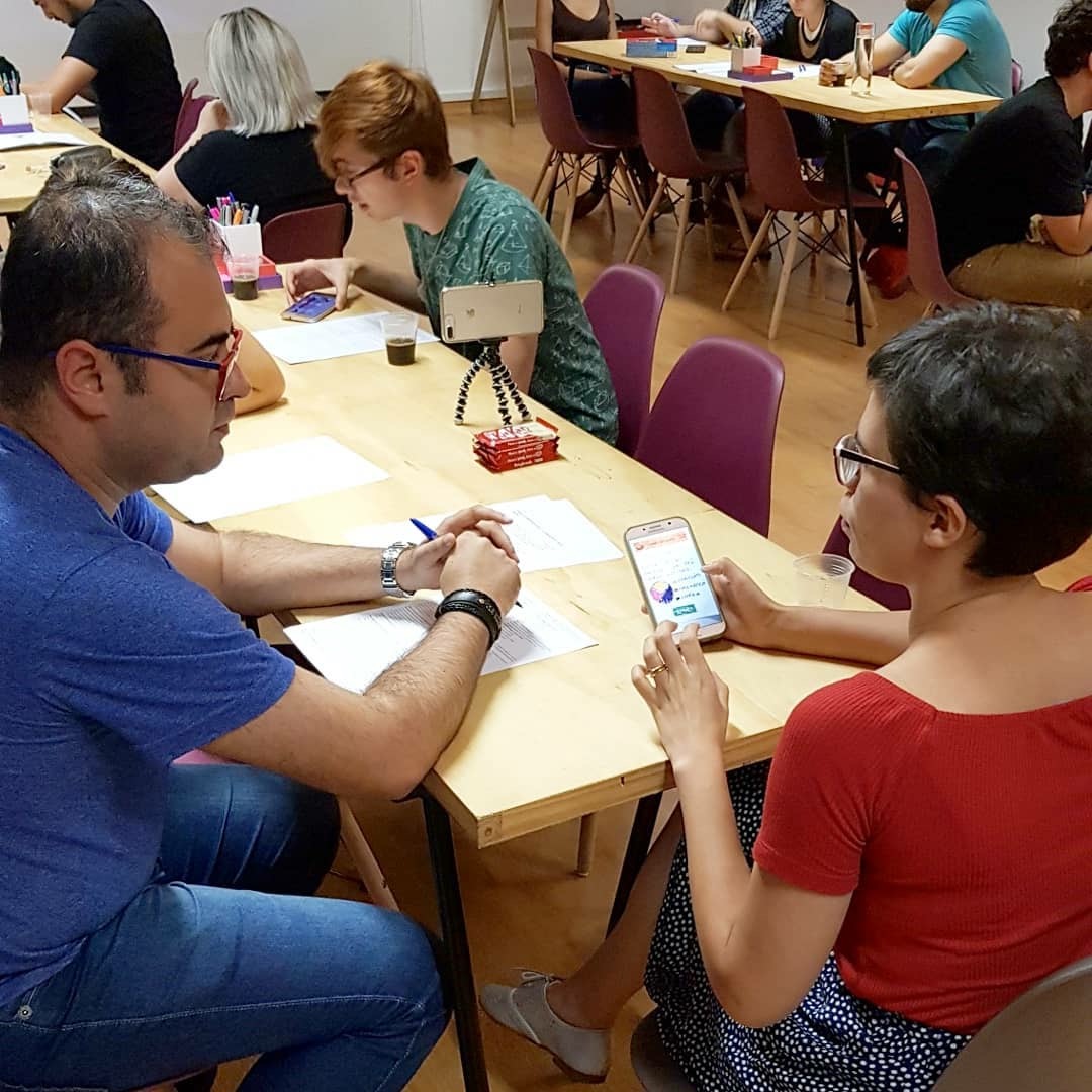
We invited four women with characteristics in common with our persona to perform the usability test. We collected great feedbacks, as an example of the user Carolina who suggested (Search for contests by area instead of institution). The answers were collected through tasks described in our usability roadmap.
Tasks for test
We did the test with crucial tasks to assess whether the solution proposal was easily assimilated. Whether the proposed flow really makes sense to the user. For example, the proposal to help candidates to organize themselves, and especially to study with conditions to pass.
After the first low test, it was noticeable the inclusion of mechanisms for personalization for users and not only an App to organize themselves, but mainly to gather content to study for the tests.
“If you don’t personalize, the person loses interest‘ Ah, it’s more of an app, I’ll get another one that suits my interests ’. So personalizing is very important ”.
Value proposition canva
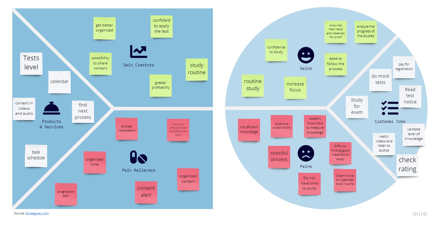
Finally, we created the value proposition of our product, so that it showed us the benefits that the customer will have when using our product.
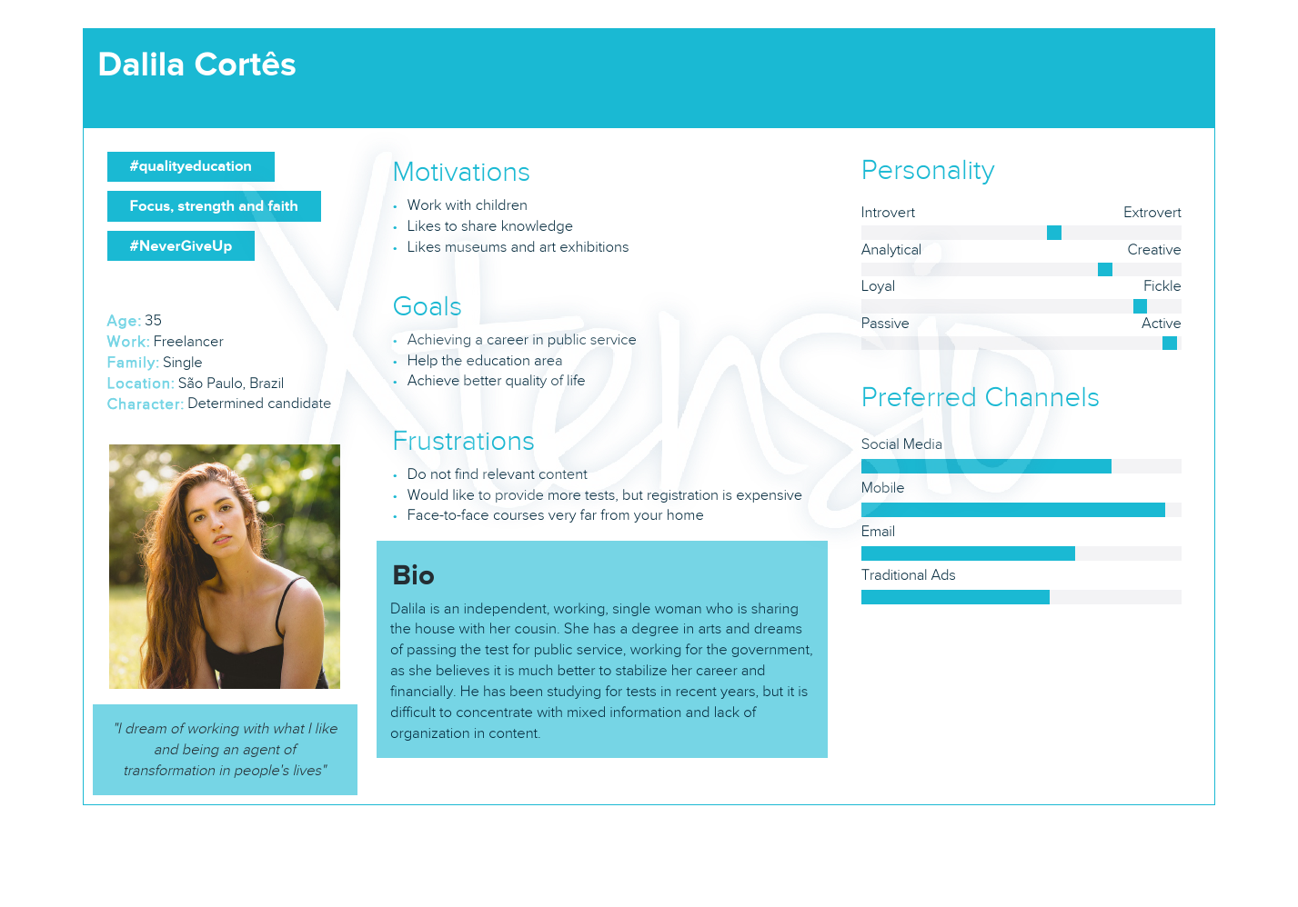
We start by mapping our user’s profile: What is important to him? We identify our user’s segment; your tasks; your pains; your earnings; and we prioritize tasks, pains and gains.
Then we move on to the value map of our product, in which we show our earning creators, mapping the list of products and services, painkillers and earning creators.
We then joined the value proposition (benefits of our product) with the user’s profile, to see if it was adequate with what our target audience expects (this occurs when you complete relevant tasks, relieve pain, and create important gains for users).
What have I learned?
More than tools, I learned to understand processes that help users better understand their desires, pains and movements.
The public services area in Brazil is very disputed, because for many Brazilians it is the only chance to achieve financial stability. And unfortunately there is still a lot of inequality with access to quality materials, internet and tools to help people achieve their goal.
